
A human profile opening into a prism that refracts a single beam of light into six coloured rays
A Field Guide Theory · Template · Self-Audit

The Six Creativity Principles

Six measurable dimensions of creative work, drawn from cognitive science and neuroaesthetics, and turned into a working template for social media. One beam of intent, refracted into a usable spectrum.

Scroll to begin Originality · Expressiveness · Aesthetic Appeal · Technical Execution · Unexpected Associations · Depth

The premise

Researchers distilled six key principles of creativity from a range of theories to form a Creativity Template for evaluating creative output.

Each principle is rooted in an established creativity framework. Together they let a creator, human or agent, judge work along axes that usually stay vague: is it new, does it move anyone, is it well made, does it surprise, can it be understood, does it reward a second look.

This document does two things at once. It sets out the theory behind each principle, then turns that theory into a practical checklist for posts on Facebook, Instagram, X and LinkedIn. And it holds itself to the same standard, auditing its own design against the six criteria at the end.

I

The principles and their theoretical foundations

Six principles, each defined, each grounded in the framework that gives it weight, each closed with the question a maker should actually ask. The figure beside every principle fuses two unrelated things, so the series argues for its own fifth principle while you read the first four.

A single luminous origami crane folded from a blueprint sheet, rising above a flock of identical grey paper planes
Principle 01Fig. 01 · the one among the many
01

Originality

The novelty and uniqueness of an idea or product. How new, how rare, how far it stands from the obvious.

Theoretical basis

Boden Theory of Creativity

Margaret Boden holds that a creative product must be new and surprising as well as valuable. She names combinational creativity, where novel combinations of familiar ideas yield original results, alongside exploratory and transformational creativity, where one searches or alters a conceptual space to reach the unprecedented. The emphasis falls on novelty: a creative outcome shows something not seen before, or a familiar thing made new, and so surprises the observer.

plato.sydney.edu.au

Guilford Divergent Thinking

J. P. Guilford introduced divergent thinking as a measure of creativity, with originality at its core, defined as the unusualness of the ideas a person generates. Asked to list uses for an object, responses score for originality by how rare they are against everyone else's. An idea only a small fraction of people reach scores highest. Creative thinkers produce ideas that are statistically uncommon, breaking from the conventional.

senseandsensation.com

Summary

Originality means seeking novel, one-of-a-kind concepts and avoiding cliché. A creative output introduces fresh perspectives or combinations that set it apart. If an idea feels familiar or derivative, it scores low.

Is this idea genuinely new or unexpected, and does it offer something unique against existing work?


An anatomical heart rendered as a loudspeaker emitting coral soundwaves that bloom into wildflowers
Principle 02Fig. 02 · the feeling made visible
02

Expressiveness

The emotional impact and communicative power of a work. How well it conveys feeling, mood, or meaning, and how far it resonates.

Theoretical basis

Amabile Componential Model

Teresa Amabile's model stresses intrinsic motivation and personal engagement. People are most creative when driven by interest, enjoyment, or passion for the work itself rather than by external reward. That investment carries emotional authenticity and energy into the output, and viewers feel it. Alongside domain skills and creativity-relevant processes, the motivational element suggests a truly creative product has heart, not only novelty.

ebrary.net

Ramachandran & Hirstein Laws of Aesthetics

V. S. Ramachandran and colleagues proposed universal laws of artistic experience that explain why certain patterns provoke strong neural responses. The peak shift effect shows that exaggerated features or heightened contrast produce a more intense reaction than realistic depiction, the way a caricature can carry a person's essence more vividly than a photograph. Grouping and perceptual problem-solving trigger a pleasurable jolt when the brain discovers a hidden pattern, an emotional reward to the limbic system. Flat or dull art does not engage those circuits.

scientificamerican.com

Summary

Expressiveness means the content carries emotional weight. Creative work should not be novel in the abstract alone; it should make an audience feel something appropriate to the context, whether joy, humour, sadness, or excitement. Infuse the work with a sense of life and meaning that viewers connect with.

Does this evoke an emotional response or tell a story, and is the feeling of the piece clear and impactful?

A golden inverted-U arch balancing stark simplicity against ornate complexity, resolving at a harmonious centre
Principle 03Fig. 03 · the optimal middle
03

Aesthetic Appeal

The visual beauty and harmony of the work. How composed, balanced, and pleasing it is across colour, layout, and overall coherence.

Theoretical basis

Berlyne Aesthetic Theory

Daniel Berlyne proposed a psychobiological model in which collative variables such as complexity, novelty, surprise, and ambiguity drive how much we like a stimulus, by setting its level of arousal. The relationship is an inverted-U: we prefer work that is neither too simple and boring nor too chaotic and overwhelming, but balanced in the middle. A piece needs enough novelty to interest and enough order to satisfy. Composition and harmony decide where it lands on the curve.

journals.sagepub.com

Martindale Cognitive Aesthetic Model

Colin Martindale argued that prototypicality, or meaningfulness, is a key determinant of preference. People often favour forms that are representative of a category because they process easily and fit an expected schema. The work need not be cliché, but it should carry an internal logic the audience grasps quickly. In Martindale's experiments, typicality explained far more of aesthetic preference than pure novelty, though some novelty still matters. We are drawn to compositions that feel resolved and elegant rather than random.

journals.sagepub.com

Summary

Aesthetic appeal comes from balancing novelty and complexity against coherence and harmony. Good composition, colour, proportion, and style make a piece both interesting and pleasant: the rule of thirds in a photo, a complementary palette in a graphic, rhythm and symmetry in a layout. Attractive work invites appreciation and gets remembered.

Is the design polished, are its colours, shapes, and type in harmony, and does it stay interesting without clutter?

A craftsman's hand and a precision caliper cutting a glowing idea-gem into perfect facets
Principle 04Fig. 04 · the cut that proves the gem
04

Technical Execution

The skill, craftsmanship, and quality in the making. Clarity, precision, adherence to standards, and the absence of flaws.

Theoretical basis

Amabile Domain-Relevant Skills

In Amabile's model, domain-relevant skills are one of the three components of creativity, beside creativity-relevant processes and intrinsic motivation. They are the knowledge, technical ability, and craftsmanship of the field: a painter's brush technique and colour mixing, a designer's command of tools and layout. Without adequate skill, even high motivation struggles to produce a truly creative product. Skill is what lets an idea be fully realised.

ebrary.net

Novelty + Value The Standard Definition

A standard definition holds that a creative product is both new and valuable. Value covers usefulness, aesthetic quality, and overall polish. A solution that does not work is not creative; an artwork that is sloppily made earns no praise, because part of its value is skilful presentation. Something novel but riddled with mistakes fails the creativity test. Technical excellence is therefore a genuine facet of creativity, not a separate concern.

plato.sydney.edu.au

Summary

Technical execution means craft and correctness: work free of typos, glitches, and inconsistencies, made with skilled use of the medium. In visual design that is high resolution, correct formats and dimensions, readable type, and adept technique. Nothing in the craftsmanship should distract from the content. Clean execution also builds trust, which raises how creative the whole is judged to be.

Is this output polished and professional, and does it meet the technical standards expected on this platform?

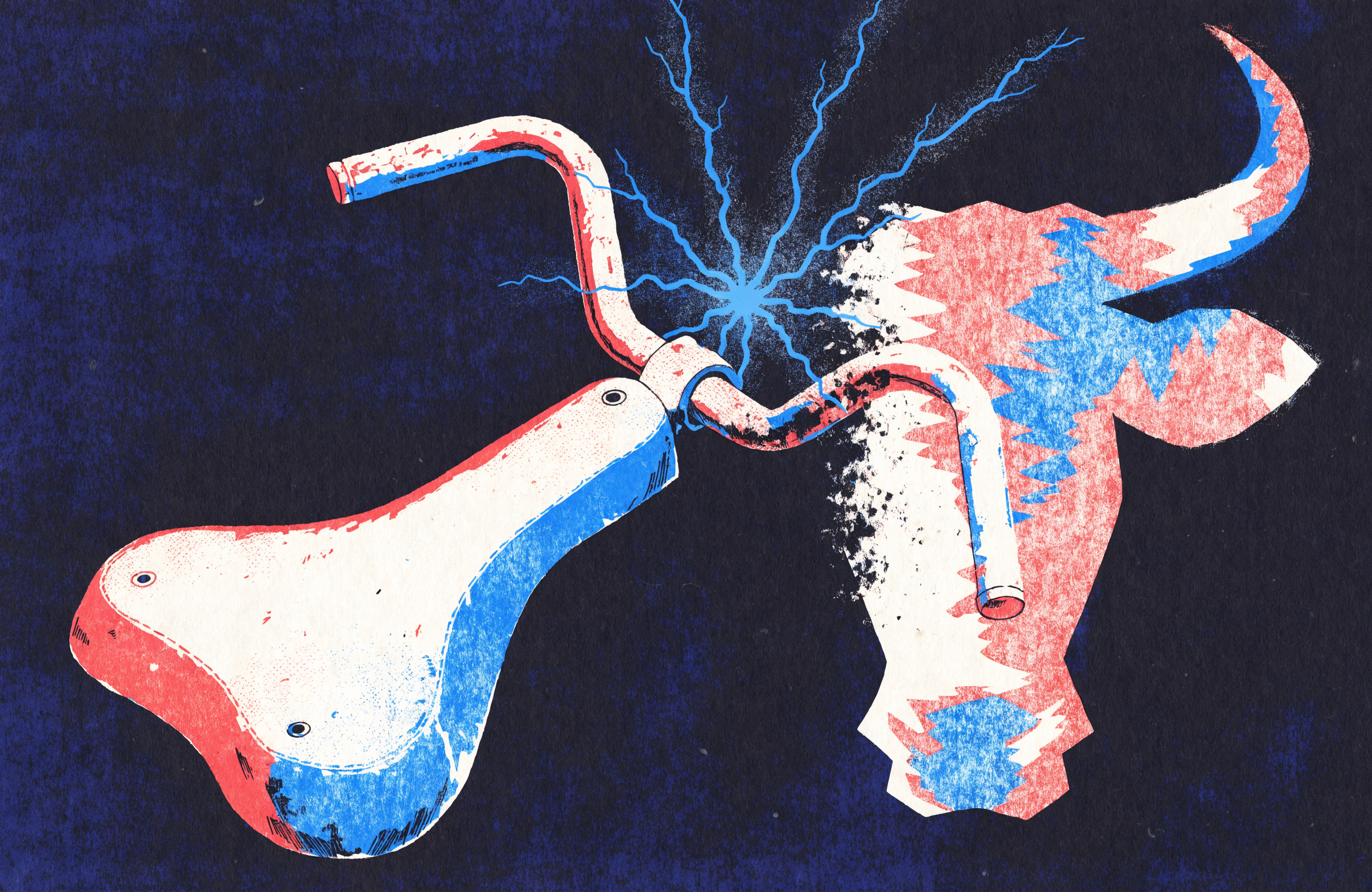
A bicycle seat and handlebars morphing into a bull's head, in the spirit of Picasso's assemblage
Principle 05Fig. 05 · bike parts become a bull
05

Unexpected Associations

The surprise and ingenuity that come from linking ideas in an unconventional way. Metaphor and juxtaposition that produce an aha.

Theoretical basis

Boden Combinational Creativity

Boden identifies combinatorial creativity as a major type: taking two or more previously unrelated ideas and merging them into something novel. The power lies in surprise. Familiar concepts combined can startle and still mean something. Many metaphors, inventions, and artistic ideas come from such pairings, the way a phone and a camera became the smartphone. Much of human creativity, from jokes to discoveries, is seeing links others miss. Value the leap across boundaries, semantic, sensory, or disciplinary.

plato.sydney.edu.au

Finke, Ward & Smith The Geneplore Model

Geneplore describes creativity as generation and exploration. In the generative phase a person produces preinventive structures by loosely associating concepts, often half-formed combinations. By letting unexpected pairings surface without immediate judgment, then examining and interpreting them, one discovers genuinely surprising ideas. Picasso assembled a bicycle seat and handlebars, then saw a bull's head. Only the unlikely association brought the work about. Generative play and unusual pairings raise the chance of an innovative outcome.

sciencedirect.com

Summary

Unexpected associations means a dose of the unconventional: metaphors, analogies, or visuals not commonly placed together. A post might connect two trending topics wittily, or pair an image with a caption that lands on second thought. The goal is the meaningful surprise that makes people think, I would not have thought of that. The link must still reveal an aptness, or the content reads as merely random.

Does this contain a surprising twist, clever metaphor, or original combination that hooks attention and still makes sense?

A field of indigo dots from which a clear figure quietly emerges, with layered planes suggesting depth
Principle 06Fig. 06 · the figure in the dots
06

Interpretability & Depth

How understandable a work is, and how many layers it offers. Clear enough to grasp, rich enough to reward a second look.

Theoretical basis

Geneplore Exploration & Meaning

In the exploratory phase of Geneplore, one interprets and elaborates raw ideas into a coherent product. A wild initial combination must be made sense of, tested and refined until it clicks. Preinventive structures hold promise for originality and use, but need interpretation to realise it. A successful creative product must be at least somewhat interpretable, or the audience misses the point. The same emphasis on exploration points to depth: rich work keeps offering new facets and personal meaning rather than exhausting interest at once.

sciencedirect.com

Ramachandran Perceptual Problem-Solving

Part of the pleasure of art comes from solving a perceptual puzzle. An image looks abstract until a hidden figure emerges, like the dalmatian among black and white spots: confusing at first, then a pleasurable revelation. That is depth, an aha earned through a little mental effort, while the image stays ultimately interpretable. Too obscure and it only frustrates; too plain and it is trivial. Good work leaves something below the surface for those who look, through hidden figures, subtle references, or layered narrative.

scientificamerican.com

Summary

Interpretability and depth means content that is meaningful and layered. The main idea should read clearly, since confusion kills engagement, while the best work offers more on reflection: a double meaning, a secondary message, an invitation to explore. Avoid the shallow piece consumed and forgotten, and the cryptic one scrolled past. Make work that is accessible yet thought-provoking, rewarding the audience the more they engage.

Will viewers grasp the main idea quickly, and is there richness or intrigue that gives it longevity?

II

The creativity template for social media posts

The theory becomes a checklist. Each principle turns into a criterion with a guiding question, so an agent can iterate through them when crafting or evaluating a post for Facebook, Instagram, X, or LinkedIn.

A central prism splits light into six colours that feed four glowing social media screens arranged around it

A creative brief and a quality checklist

One creative source, refracted into six checks, fed to every channel.

Six criteria, six questions

Iterate until each is met
01

Originality

Does the post present a novel idea or unique visual style that sets it apart from typical content?

Encourage fresh perspectives and avoid overused formats or stock clichés. Use an uncommon analogy or an inventive graphic concept. The aim is for the audience to say they have not seen something like this before. On visually saturated platforms this means creative imagery or a distinctive design theme; on X or LinkedIn it can mean an original insight or an unexpected hook in the text.

Ask: what is uniquely you about this post, and would it stand out in a crowded feed?

02

Expressiveness

Does the content evoke emotion or tell a story effectively?

Aim for an emotional connection. Use visuals, colour, and words that carry the intended mood: vivid tones for excitement, a calm palette and thoughtful caption for sincerity. Consider whether the viewer will feel something, laughter, inspiration, nostalgia, empathy. Match the emotional tone to the platform, upbeat and conversational for Facebook, polished inspiration for LinkedIn.

Ask: what emotional response am I aiming to trigger, and is every element working toward it?

03

Aesthetic Appeal

Is the post visually well-composed and attractive?

Check the fundamentals: balanced composition, visual hierarchy, the rule of thirds, harmonious and on-brand colour, legible type, and a clean layout. Each platform has its norms, magazine-quality imagery on Instagram, a tidy professional graphic on LinkedIn. Preview on mobile, where most people will see it. If anything looks off, awkward cropping, clashing colour, too much text on an image, refine it.

Ask: would I find this appealing and professional in my feed, and does it invite me to stop and look?

04

Technical Execution

Is the post technically polished and optimised for each platform?

Use high-resolution images, correct aspect ratios and dimensions to avoid awkward cropping, and smooth, well-trimmed video. Verify grammar and spelling; typos undermine credibility. Mind platform specifics: gripping first seconds and captions for auto-play muted video, the right format for Stories, Feed, or Reels, images that are not cut off in the X timeline, correctly formatted hashtags and mentions. Remove any technical roadblock so the idea can shine.

Ask: are all visuals and text clear and error-free, and does this meet the platform's specs on every device?

05

Unexpected Associations

Does the post include a surprising element or creative twist that catches attention?

Incorporate at least one delightfully unpredictable facet, in the message, a witty juxtaposition or a fresh play on words, or in the visuals, an image combining two unrelated things or a bold remix of a familiar template in a new context. On X a clever mashup of two trends; on Instagram a surreal edit or an ironic image-text pairing; on LinkedIn an analogy from another field, such as office teamwork compared to a jazz ensemble. Keep it relevant and coherent with the message.

Ask: does this have an X factor, something novel or clever that a standard post on this topic would lack?

06

Interpretability & Depth

Is the core message clear and accessible, and does the post also offer depth that encourages reflection?

Make sure someone scrolling by grasps the main point fast; clarity is everything given short attention spans. Use concise, plain language, and a headline or graphic that telegraphs the theme for complex content. Then add a layer of depth: a thoughtful question, a surprising statistic, a metaphor to ponder, or a tie to a broader narrative or cause. On LinkedIn that might be a personal anecdote leading to a universal lesson.

Litmus test: would this prompt me to talk about it or share it with someone else?

Working the template

For each principle the agent iterates. If a criterion is not met, the post isn't original, the design looks cluttered, revise that aspect. Trade-offs appear often: a complex image can add depth while reducing clarity, so the template also helps balance the elements. The result is a well-rounded post that attracts attention, resonates, and engages, while looking professional and polished.

Adaptation across platforms

The six principles hold everywhere. Their expression bends to each platform's context and audience.

Instagram

Aesthetics and feeling, led by the visual

Premium on aesthetic appeal and expressiveness through imagery. Keep photos high-quality, on-brand, and evocative, with cohesive filters across the feed.

LinkedIn

Depth and professionalism

Originality and unexpected associations are welcome in a professional register: a novel business insight rather than a meme-style surprise, depth that earns discussion.

X / Twitter

Originality and wit in text

A fast-scrolling feed rewards a snappy, novel one-liner. Lead with the hook, and check that any attached media is clear and well-composed.

Facebook

Storytelling and emotion

Versatile, but storytelling and emotional expressiveness do well, along with native video where execution matters: captions and a strong thumbnail.

III

The template, turned on this document

A template earns trust by surviving its own test. Here this field guide grades itself against the six criteria, naming the specific design move behind each verdict. The audit is also the document's second layer: read once it is a guide, read again it is grading itself.

Originality

Met · by construction

The series refuses the stock-photo reflex. Every figure fuses two objects that do not belong together: a crane folded from a blueprint, a heart wired as a loudspeaker, bicycle parts becoming a bull. The page argues its first principle instead of asserting it.

Expressiveness

Met · through colour

Colour carries feeling. Each principle owns one hue from a six-stop spectrum, and that hue saturates its chip, its plate, its caliper caption, and its summary border, so the mood shifts as you move down the page rather than staying flat.

Aesthetic Appeal

Met · held near the peak

Order keeps the vivid palette in check. A single ink ground, one display face used sparingly, a strict grid, and disciplined spacing aim for Berlyne's optimal arousal: lively, never loud. The light reading panels relieve the dark immersive ones, the variety that the inverted-U asks for.

Technical Execution

Met · built to a floor

Type scales fluidly with the viewport, motion yields to reduced-motion settings, focus and contrast hold up, and the layout reflows to a single column on a phone. Images run at 2K. The craft is meant to disappear behind the idea.

Unexpected Associations

Met · in the conceit

The governing idea is itself a juxtaposition: a scientific field guide crossed with a creative manifesto. Specimen numbers, figure captions, and a measurement grid sit beside refracted light and blooming wildflowers. Rigour and play, deliberately mismatched.

Interpretability & Depth

Met · two readings

Read once, the structure is plain: six principles, then the template, then this audit. Read again, the document is grading itself against the very checklist it teaches, a quiet second layer that rewards the return visit instead of exhausting itself at first glance.

Theoretical foundations

References

Boden, M. A.
Creativity as requiring novelty, surprise, and value; combinational, exploratory, and transformational creativity.
Guilford, J. P.
Divergent thinking, with originality as the statistical rarity of ideas.
Amabile, T.
Componential model of creativity, emphasising domain-relevant skills and intrinsic motivation.
Ramachandran, V. S. & Hirstein, W.
Laws of aesthetic experience (grouping, peak shift) explaining the emotional aha response to art.
Berlyne, D.
Arousal-based model of aesthetic preference; an inverted-U between complexity or novelty and liking.
Martindale, C.
Cognitive model of aesthetics highlighting prototypicality and meaningfulness as keys to preference.
Finke, R., Ward, T. & Smith, S.
Geneplore model: generation of preinventive forms and exploration to find meaning.